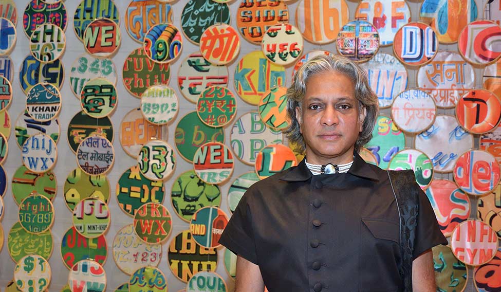
Scenographer Sumant Jayakrishnan introduced his installation Chakraview to Indian audiences at the Serendipity Arts Festival that concluded recently in Delhi. Originally presented at the London Design Biennale 2016, the walk-in installation is a metaphor for the Indian street. Jayakrishnan has used handmade, painted signages as wall hangings to display fonts in 22 Indian languages, including Gujarati, Marathi, Tamil, Urdu, Hindi and Bengali.
“The design is all about the street. When you walk on the streets, you see signs and people,” says Jayakrishnan. “In this case, it is like walking along a mirror that gives you infinite reflections. So it is a long, endless space. It is my take on the people’s representation on the street.”
The installation explores the concept of ‘utopia by design’. Jayakrishnan and India Design Forum founder Rajshree Pathy, whom he met at Somerset House, the venue for the London Biennale, tried to configure a metaphor within the Indian context. “Utopia is something which is really to do with society, the perfect one. Something that one aspires for, but can never achieve. So it is aspirational,” says Jayakrishnan, who began working on the project last July, with Alice Cicolini, a London-based designer who also wrote the catalogue for the installation. Together, they explored the multiple layers of the chakras and realised that it worked perfectly for them.
“The chakras are associated with fire, water, air and earth; there are also different colours associated with it like red, orange, yellow, green, blue, indigo and violet,” says Jayakrishnan. “There are several forms as well that are associated with them that gave us a skeleton. It is those layers that became part of the project.”
The installation includes the first language of different Indian states. Aadyam fabrics, sourced from Bengaluru and handwoven in Benaras, have been used in the chakras. The idea was to use reflective materials. So, stainless steel was picked over mirrors, for its strength.
The installation in Delhi was an adaptation of the original piece with minor changes in the text, gradation, size and languages. “It is very similar to the London Design Biennale, except that the one in London was a double spread,” says Jayakrishnan. “As artists, we always change and try to improve the gradation. At first, it may look like a mix of colours, but if you move a little away, you will notice that red moves into yellow which moves into blue. We have also included some extra fonts.”
The chakras became a part of the project for a reason. “We were trying to see the visual world through them,” says Jayakrishnan. “Chakras are one of the biggest exports of the yogic world and meditation, which is now universal. However, chakra is at the heart of it.” Since chakras are not religious in any way, Jayakrishnan thought of using them.
The design conveys a sense of India, not in a spiritual but a funky way. Which is why, Jayakrishnan says, it will connect with people globally. “I think this design has a life and people respond to it,” he says. “It has got an intellect and it adapts to different places.”


